
 If there is an iconic color combination that says "Provence," then (in my estimation) it is blue and yellow (or shades of purple and yellow). How do I intuit this? I have not been to Provence. I do not know Provence. I will be in France this summer. Provence is not, unfortunately, on my itinerary. Yet such is the power of popular culture on individual imagination in that it supplies us with facets of a life, images of a scene.
There are books on Provence, and images to be found using Google, and those table cloths sold at perhaps nearly every street fair in America to help us construct multiple Provences. Each sells an image of Provence. And each sale (I use the term loosely, even metaphorically), creates an expectation. Perhaps that is why so many feel tinges of disappointment when visiting the reality of that which had hitherto been an image: it fails to accord with our imaginations.
When designing gardens, some employ particular colors to evoke particular moods: pink for romance, orange for boldness,white for ethereality.
 I've always appreciated the combination of blue and yellow--not because I wish to fabricate an approximation of a place I have not visited, but because vivacious yellow is tempered by cerebral blue, while meditative blue is enlivened by blithesome yellow.
Color need not always come from flowers. {Side story: At afternoon tea on Thursday, tea-house matron Judy and I chatted wildly away about gardening and flowers and cats and other such things, and in the course of conversation the issue of annuals came up. Suddenly, the "g" word passed from my lips. Yes. Right in front of a woman gardener of a certain age. Garish.
I scanned her face for a look of horror, when she burst out with laughter and whole-heartedly agreed with me: "Yes, garish! Oh Yes! That's exactly what they are!"
Now, let me put that in context. For the perennial gardener, the annual placed here and there to "fill space" might will look garish especially if little else is in bloom, as will gardens comprised solely of annuals (which is not, it seems to me, gardening--SNOB ALERTS ARE BACK!--but "dressing up" space, filling it...it just isn't gardening. Not in my view. But who am I to adjudge the act of gardening?!}
In any case, color can come from foliage, and I design my gardens around the juxtaposition of foliage textures and color variations, though of course with an eye always to the color of the perennial flower and its respective bloom time. The effect is subtle; perhaps sublime, but certainly more subtle than using flowers.
My yellow and blue combinations are varied, the effect always the same. As I wrote in a previous entry, "if blue anchors the sky in the garden, yellow anchors the sun."
Sometimes, flowers do the work for us, as with the Columbine and Spiderwort:


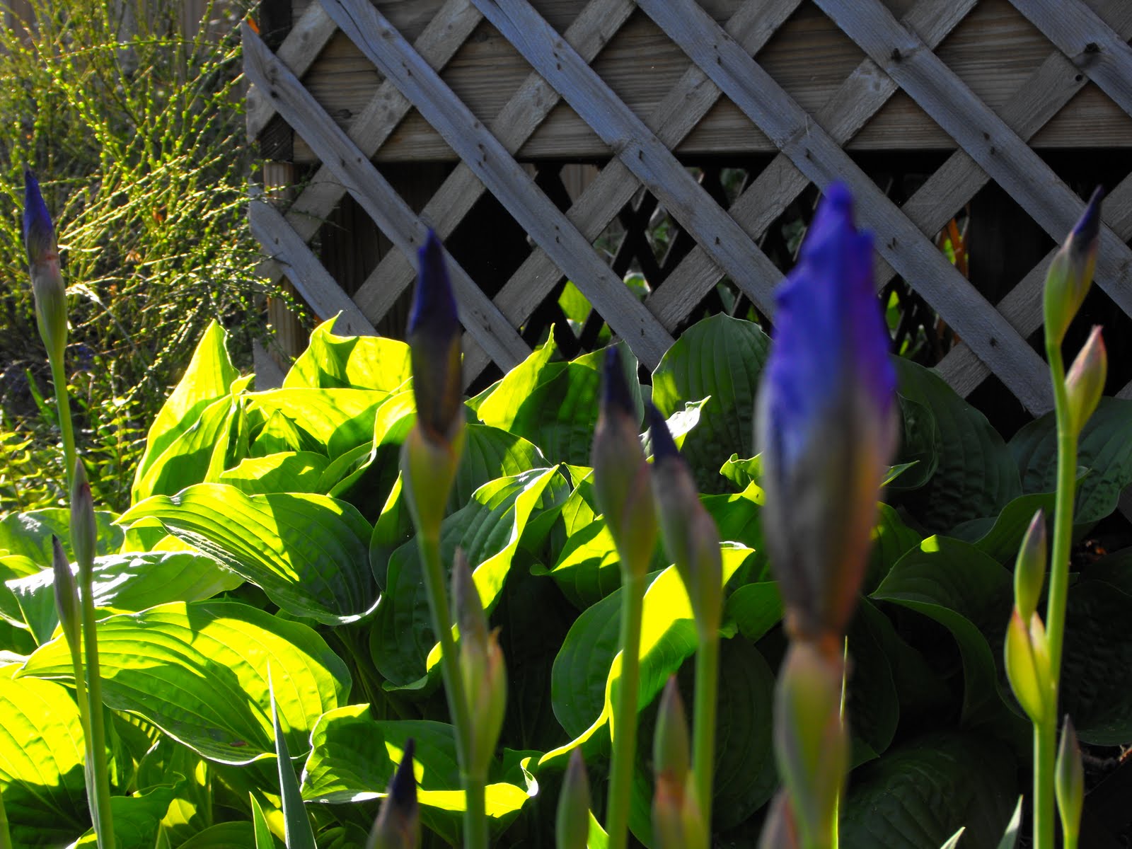
Other times, blue and yellow (or variations thereof) appear without planning or foresight, as with these pale purple bearded irises that were mixed with the yellows:


The recent planting of the Gaillardia Gallo Yellow near the Tall Purpletop Verbena was deliberate (it is also appears against a backdrop of lavender,which is planted in the second tier of the front sun garden);

But sometimes I have no idea where to situate a plant, such as this Citronelle Heuchera villosa, as it looks good against a backdrop of Cobalt Blue Bearded Iris blades (it really pulls out the bluish-grey hue),

and against the Nikko Blue Hydrangea,

and, of course, against Miss Grey Kitty (though she looks smashing with everything!)
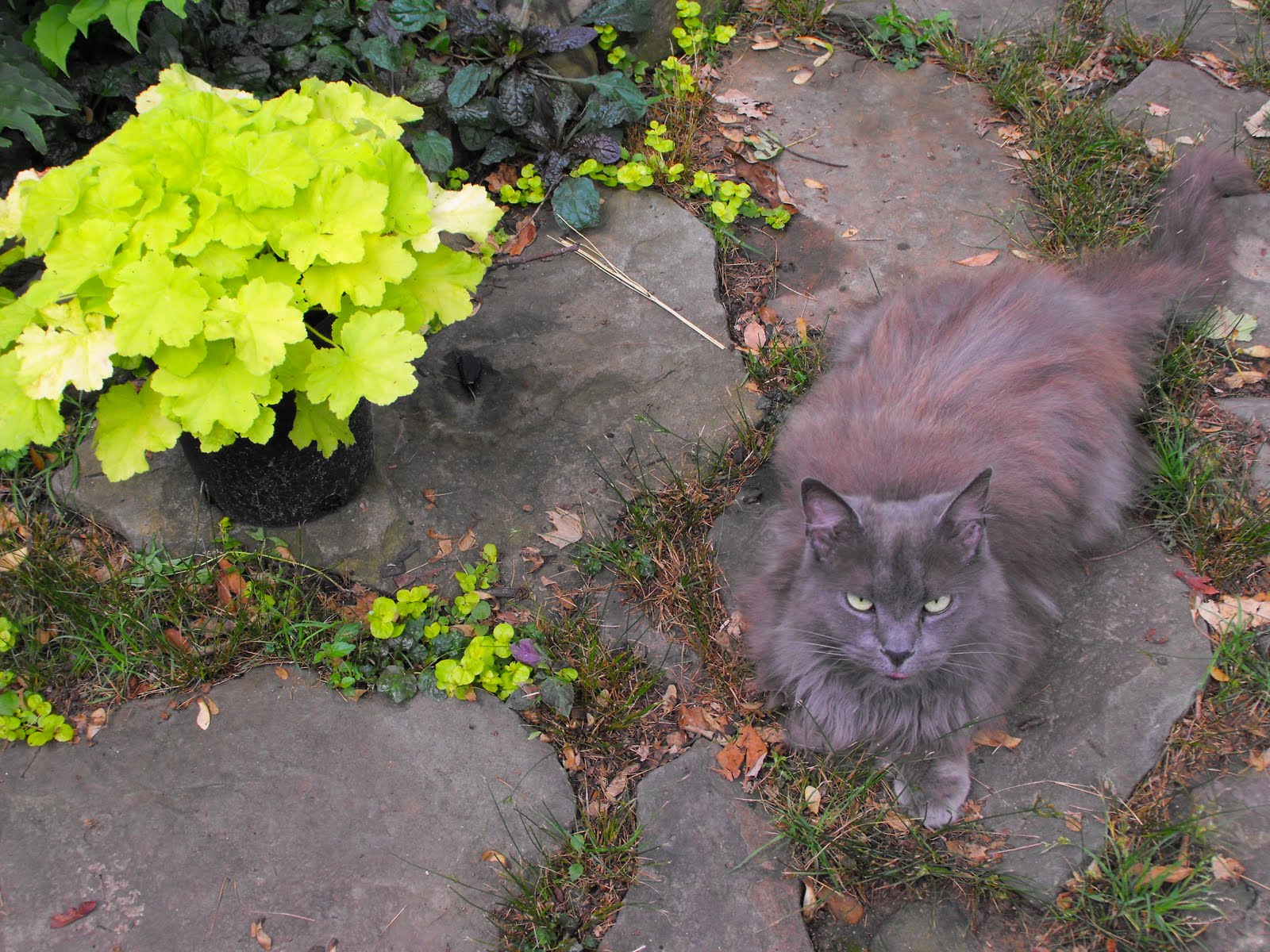
In the end, I placed the Citronelle Heuchera next to the (cobalt blue) bearded irises; the effect is more subtle and, I think, more sublime. Miss Grey Kitty agrees.

No comments:
Post a Comment